Friday 5 December 2014

Research For Scheduling Questions

Research For Scheduling Questions

State the day, time and channel of each programme.

Who commissioned the programmes?

Bad education- Chris Sussman
Miranda- Cheryl Taylor

Who produced them?

Bad Education-Ben Cavey (BBC)
Miranda-Jo Sargent (BBC)

What audience are they aimed at? Why? Bad Education-it is aimed at teenagers and young adults because they can relate to most of the incidents in the programme. Miranda- middle aged adults because they can relate to the situations e.g. pub/work/home

Why are they on at that time and on that channel? Link to 'type' of comedy and target audience.  Bad Education- on BBC because the producer was hired by the BBC and it is on at 10:00 because of the language used in the episodes it needs to be on after the watershed. Miranda is on at 8:30 on BBC one because it is not as rude and BBC 1 has a set target audience which fits the programme.  
   
Are they on after the watershed? Why? Bad education is on after the watershed because of the language used in the programme and Miranda is on before because it isn’t very rude compared.
Know the audience demographic

You must know:

day- Bad Eduaction- Tuesday Miranda- Wednesday

time- Bad Education-10:00 Miranda- 8:30

channel-Both on BBC. Bad Education is on BBC 3 and Miranda is on BBC 1
Tuesday 7 October 2014

Conventions Of A Sitcom

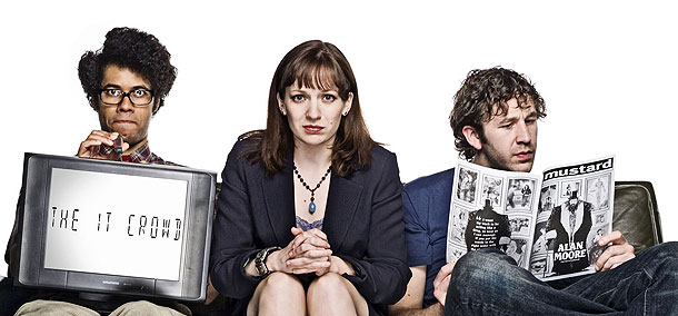
                                                    The IT Crowd


The conventions that this sitcom are that it has canned laughter (audience laughter sound), always set in the same environment, has a catchy theme song so you Can detect it fro anywhere, character stereotypes such as being socially awkward and not being able to talk unless its over the phone to other people. The opening scene is connected to the title of the show as in the fact that it is pix-elated images so it looks like a retro computer considering the sitcom is based around computers. The most obvious convention of a sitcom is that it is roughly 30 minutes long which is identical to nearly all sitcoms. The comedy in a sitcom like this is supposed to be very 'cheesy' way which makes it comical to a certain extent. Also injury gags are very common in sitcoms similar to this.

Tuesday 16 September 2014

5x5

Music:

I can't go a day without listening to music so i would class it as probably my favorite genre of media, i'm a big gig addict and my genre range is very wide but I've narrowed it down to 3 main favorites. I like genres such as rap, drum and bass, and house. Artist i personally favorite are Odd Future, Dub Pistols, SBTRKT, Tyga and Disclosure.

This is Tyler, the Creator. He is the "Creator" of Odd Future and
has a net worth of 4 million dollars.


Games: 

As well as listening to music all of the time my life is devoted to gaming. My top 5 games include; FIFA, Battlefield, Warface, Outlast and clash of clans. My most anticipated games of this year are The Crew, FIFA 15, Little Big Planet 3, GTA 5 next gen and Dead Island 2.

Films:

I love passing time with films every now and again. My top 5 films are; Avengers, Iron man 3, 21 jump street, 22 jump street and bad neighbors. I'm still wanting to watch the latest transformers but haven't
 got round to it.


Fashion:

I know this isn't a big side of media but i am a man for fashion. Favorite brands include; Lactose, Nike, Adidas, OFWGKTA and Stussy. 

Monday 15 September 2014

Magazine Evaluation Task

Evaluation:
How effective was your research into similar magazines and relevant target audiences. What did you learn from your research into these two areas? In what ways did this shape the creation of your magazine?

My research in to similar magazines was very effective in my opinion, when you look at my magazine you can clearly see the resemblance between the grungy, punkie rock Mags that I researched before creating my own. From my research I learnt that the magazine has to be subtle but look rough in its appearance which is what I did. This made me also copy the standard colour pallet for rock magazines as you can see on my magazine and if you compared it to another magazine in the genre such as kerrang! I also learnt that the front of a magazine doesn’t have to have much on it to be appealing to the human eye and mine was kept very simple.  

What creative decisions did you have to make at the different stages of your magazine production? How did your magazine change as your work progressed?

Creative decisions I had to make were adding a grungy boarder to add effect to my magazine. I edited the photo to black and white to give it the simplicity effect to make it look a bit cooler. On my contents page you can see the simplicity that I carried throughout the three parts of the magazine. On the contents page I used the same scheme to make the magazine look more official throughout. Also on the cover I de-cluttered it so it looks more simplistic which is attractive to modern audiences according to some research websites. When I first started designing the cover I originally had the idea it was going to be big bulky and crammed with loads of random quotes from articles that could possibly be in the magazine to make it stand out to other people that go into shops searching for those grungy based magazines. But then I decided to change it to a more alternative rock magazine because they are more popular in modern media. One point that I need to change is that I need to make my double page look more alternative than it is at the moment.

 How closely does your magazine follow the forms and conventions of existing magazines? Gives examples of real magazines you reference.

I would personally say that my magazine doesn’t follow the exact same suite as others in my genre but adds its own effect to the area of magazines mad makes itself unique in its own way which makes it stand out more than others in its respected area. If I compare my magazine to kerrang which I personally think is the lead magazine in this genre I would say that some aspects of my magazine have resemblance but mainly it is one of its own. I would say it does follow the more important ones such as the artists involved and the fonts and colour scheme used.

How successful is your finished magazine? What are its strengths and weaknesses?


I would say my finished magazine was successful; it covers the main conventions which is very important. I would say its strengths are the front covers look and the boarder effect throughout. Strength was the contents page because it was simple but effective and included interesting facts. The main problem with my magazine I would say is that my double page spread is very bland and doesn’t look very attractive to look at its just to plain to attract people to it and I don’t think its overall appealing and I think it lowers the quality of my magazine.